In the nineteenth century, text became ornament as never before. Typeface designers produced hundreds of ornate and eclectic fonts intended to draw viewers’ attention with their artistic novelty. Sumptuous text dominated the page in everything from railroad timetables and business stationery to theater programs and almanacs. A new exhibition in Roger H. Perry Hall, on view starting next week, features examples of lavish and whimsical Victorian typography from Champlain College’s Special Collections published between 1870 and 1900, the height of Victorian design in the United States.
Exuberant typefaces adorn the covers of many of the sheet music scores in our collection, such as these fun examples included in the exhibition:
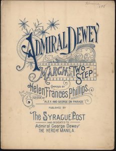
Admiral Dewey March and Two-Step, by Helen Frances Phillips, 1898, Llewellyn Collection of Vermont History, 2010.1.2
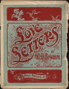
Love Letters sheet music cover by C.D. Bingham (1898), Llewellyn Collection of Vermont History, 2010.1.33
Also on display is this eye-catching brochure, containing a routine list of train schedules:
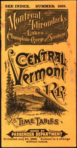
Central Vermont Railroad Time Tables brochure, Summer 1888, Local History Collection, 2017.52.1
Following the Victorian philosophy of more-is-more, even a garden variety business letter provided an opportunity to present several lavish typefaces together:
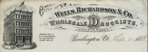
Wells, Richardson & Company Billhead, 1878, Local History Collection, 2017.50.1
This exhibition, on display through the end of the spring semester of 2019, illustrates the extent to which text can make the ordinary extraordinary.
-Erica Donnis, Special Collections Director